
Cantera allows athletes to enhance their talent with psychological, technical, tactical and physical training.
About the project
Cantera is an application that helps athletes to improve their performance. It provides different interfaces to coaches, parents and atheletes and makes the communication better between themselves

Coaches
Evaluate the collective and individual performance of players in each game, app allows them to monitor the players over time. They can send messages to their team and assign trainings tasks

Athletes
They learn about their strengths and areas for improvement through feedback from their coach. They can report mood, sleeping description, and hydration info. They can upload videos to their gaming profile.

Family and Fans
They can share photos and videos to make match days extra special. Cantera allows them to follow the development of their children.
My role in the project
I was UI Designer in Cantera, when I started in this project the application was already released and 80% of the screens were developed. My assigment was to improve some existing designs and create some new screens following the design guidelines they had stablished before for the app.
Tools used: Sketch and Adobe Illustrator
01.
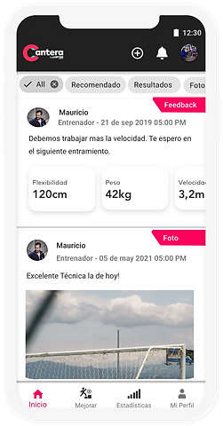
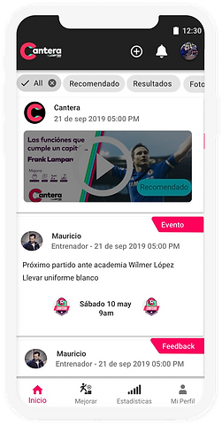
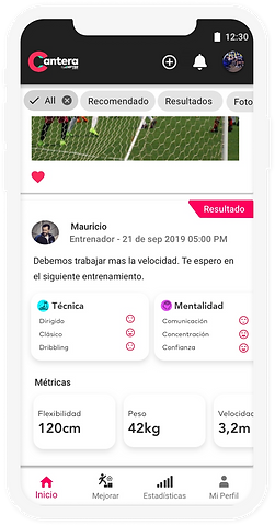
Feed screen
What was required?
This screen was needed for athletes, to show: events, measures results, coaches messages, media to trainings or past games, also recommended media from coaches...
Challenges
-
Too much content to be showed
-
Hierarchy needs to be clear
-
Easy navigation
-
Avoid too much text
How was it solved?
Going back to the basics of heuristics
Recognition rather than recall
User control freedom
Aesthetic and easy
readibility
Recognition rather
than recall
Recognition and
Visibility
Interactive
Flexibility and Efficiency
Aesthetic and easy readibility
Interactive
Consistency and standards
02.
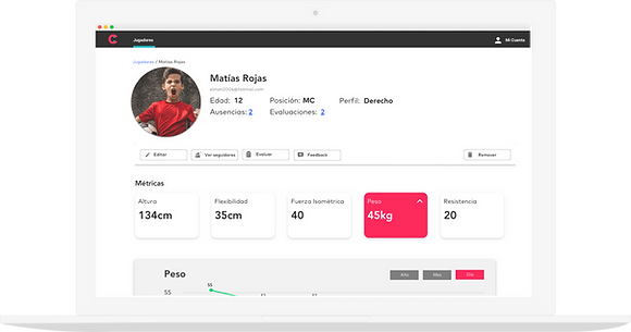
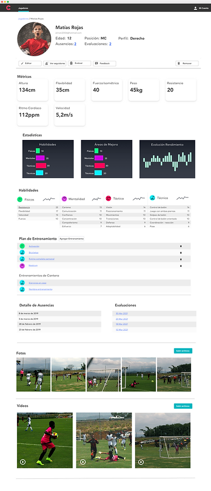
Player dashboard screen
What was required?
This screen is for coaches, it should show:
-
The metrics recorded in each training
-
Last feedbacks provided
-
Media related to the trainings
-
Evaluations
-
Skills scores and summary
-
Asistance record
-
Statistics
-
Assigned trainings plans
Also main actions on player profile should be included here:
-
Edit information
-
See followers
-
Evaluate player
-
Submit feedback

How was it solved?

Flexibility:
-
Profile summary of the player
-
Links to the record of assistance and past evaluations
Main actions on top
Metrics easy to read and with the option to display a trending chart with the behavior of it
Skills categories displayed:
-
Keep icons displayed so that coaches can identify faster each skill
-
List of scores for each rubric
-
Mini chart that gives a fast idea to the coach on how is the player going
Training plans
-
Option to add a training
-
Remove one of the assigned
-
Lynk to the detailed view of each excercise
More detailed view of the assistance records and done evaluations (these were included in the top summary for faster access)
Media related to trainings and matches with the option to upload more
03.
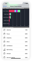
Submit player evaluation
What was required?
-
Coaches need this screen to fill evaluations and provide feedback for players
- This evaluations could be done during the trainigs, so the need to be easy to fill and read
- Display a space where coach can provide open feedback to player
How was it solved?
-
Hyerarchy in the information:
-
Include a top summary of player profile
-
-
Easy to read and keeping consistency with icons for each of the categories of the evaluation (techniques, mental, tactics and physic) this way coaches can identify the sections easier and faster.
-
Using a face rate method, easy to fill for coaches during the trainings
-
Giving coaches the flexibility to write a more detailed feedback at the end of the evaluation.


Conclusions
This project taught me that, as a designer, sometimes we need to take a composition already started and improve it or create new designs from it without causing a misalignment with the rest of the interactions. I learned that this does not limit our creativity, quite the opposite, it allows us to be more creative.
Additionally, one of my favorite challenges was considering the environment where the users, (specially coaches) would need to access and fill the screens, meaning during a training or player evaluation, so these had to be easy, flexible and fast, but the interesting fact is that most of these challenges were solved with the basics of heuristics and keeping the design simple.
Thanks for watching!