
Microsoft Products Pages
Accenture for Microsoft
About the project
Microsoft requested multiple product pages, some of these were new pages for which we designed from wireframes until a final UI design, also we delivered development specs and handed off assets for page construction. There were special projects as campaing websites or websites where new product branding needed to be applied.
My role was as UI Designer, working in wireframes, design, preparing assets and production specs documentation for developers.
Tools used
-
Adobe Illustrator
-
Adobe Photoshop
-
Adobe XD
-
Figma
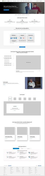
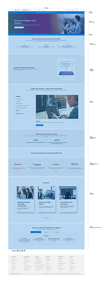
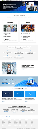
Data Platform Website
This was a special website that required 2 versions: Page for developers and Page for companies
I worked in all stages, a total of 7 rounds
01. Wireframes
Initially, Microsoft just provided a Brief of the website, with an UX research done previously and with an idea of page structure. With this I started creating a structure with the content knew at the moment. And placed some images as placement only.
02. Product branding
This product had a special branding that needed to be applied in both pages so, I started some explorations, this implied a research on the components used from the design system to confirm or descart if it was possible to apply branding on them (like background colors or color personalization)


03. UI Design and Handoff
While we delivered multiple rounds we received more insight from Microsoft as content doc and some requirements for images. Once approved I prepared the production ile for development and assets needed.
Process Overview
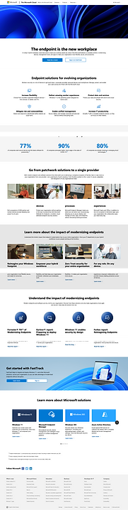
Campaign Projects
These projects were campaigns that Microsoft released to announce a new software or a new feature in a product.
Campaigns have a home screen and children websites relate to it and what make them really special is that there is an specific branding to be applied, but without breaking the hierarchy between home and children pages.
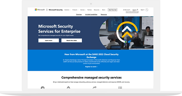
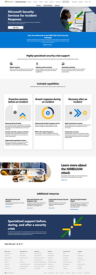
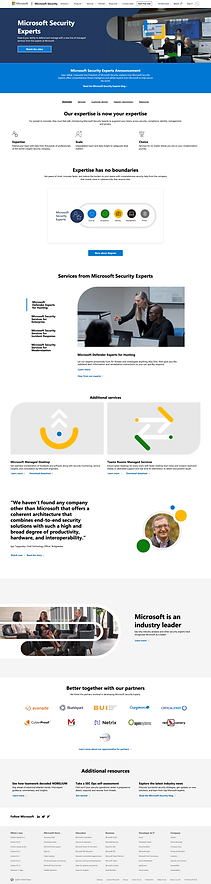
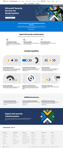
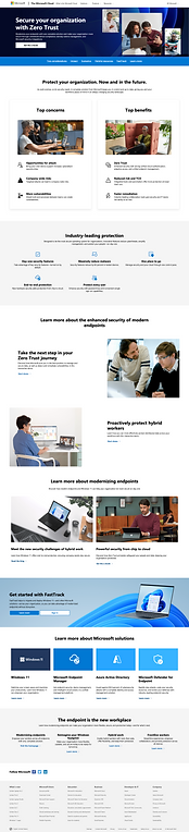
01. Security Campaign
The branding of this campaing was composed by multiple shapes and colors, reason why multiple explorations were done to apply shapes depending on the context of the copy.
Also, having a different shape for each product, helped to differentiate them but also giving the page a branding element.
Wireframes
Branded Shapes Explorations
Children websites
Final Designs

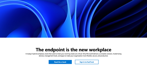
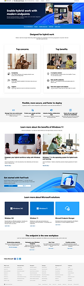
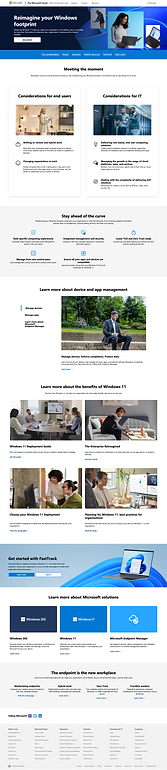
02. Windows 11 Campaign
The branding of this campaing was composed by a main element called "The Bloom", there were a lot of restricitions on the way it had to be applied and that was the main challenge.
This campaing took 1 week to be designed, we worked on multiple explorations specially for the Hero components and for an Announcement blade present in all pages.
Some Design Process
01. Hero Designs
On this campaing project I was in charge of the homepage, it was a challenge cause it dictates the design for the children pages as well. Considering this I proposed using The Bloom as the main element of the home page hero and using it as a background in children pages but adding lifestyle images on it.


02. Announcement Component
The function of this section was to promote a software to help users migrating to Windows 11, it must be present in all pages with same copy content, reason why we made multiple explorations. At the end, client decided to go with the one with the Bloom element on it.


Final Designs
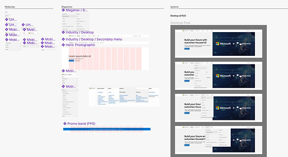
Industry Navigation Menu
This project was about redesigning the Industry pages navigation menu. Microsoft did a research on which links and information were users searching the most and decided to redesign the way menu was display.
Research and Analysis
Since this was all about building a new comoponent, I decided to first analyze the standards Microsoft had in their webistes.
Atomic Design
Then I started working with an Atomic design methodology to build the component as detailed as I could.
Explorations
I worked on multiple explorations for Desktop version using a 12 grid system and also did some explorations on Mobile version.
Findings
Microsoft had an initial idea they wanted to implement but, when putting this mockup with a page layout we realized there were some conflicts with other comopnentes like in page navigations and alert banners. So, we delivered all explorations, recommedantions and findings documentation.
Accessibility markups
Microsoft placed a strong emphasis on accessibility within the product pages. As part of the handoff to the development process, the following markups were mandatory:
Keyboard: Tab stops
Screen reader labels
Alt text
Landmarks
Headings sizing
Table & Forms guidelines
Visual design assessment
The following are some examples of specifications for accessibility markups